Do you profit from recurring trends in the Dow Jones Index?

by SMO Team
The Dow Jones Industrial Average (DJIA) is a stock market index that tracks 30 large, publicly owned companies trading on the New York Stock Exchange (NYSE) and the Nasdaq. The DJIA is the oldest stock market index in the U.S., and it is one of the most widely followed indices in the world.
Do you profit from recurring trends in the Dow Jones Index?
What is the best time to invest?
If you are interested in the outcome of these topics, read the following article and subscribe to our newsletter to never miss another analysis.
Recurring trends - seasonal patterns
Recurring trends are probably familiar to all of you. Sayings like "sell in may and go away but remember to come back in september" have surely been heard by everyone. The Santa Claus rally is also a well-known phenomenon on the stock markets.
Let's check the seasonality for the Dow Jones index. There are bound to be interesting recurring trends.
Dow Jones - Seasonality Chart
We start with a simple seasonal chart of the Dow Jones Index for the last 20 years. To create this chart, the average of the last 20 years is calculated for each day in the calendar.
As you can see in the chart history, there are two periods in which the chart rises significantly.
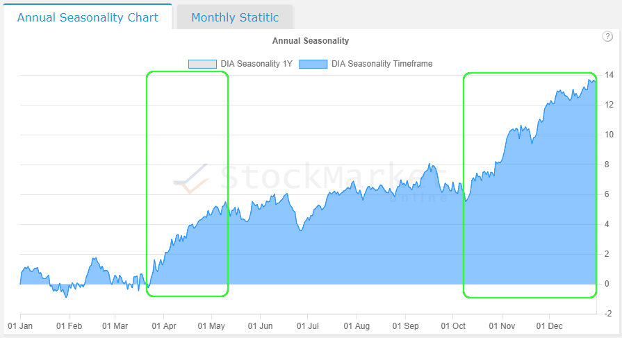
The first period begins in late March and ends in mid-May. The second period begins in mid-October and ends at the end of the year.
- End of March until mid May
- Mid-October until the end of December
Let's analyze the time frames in more detail.
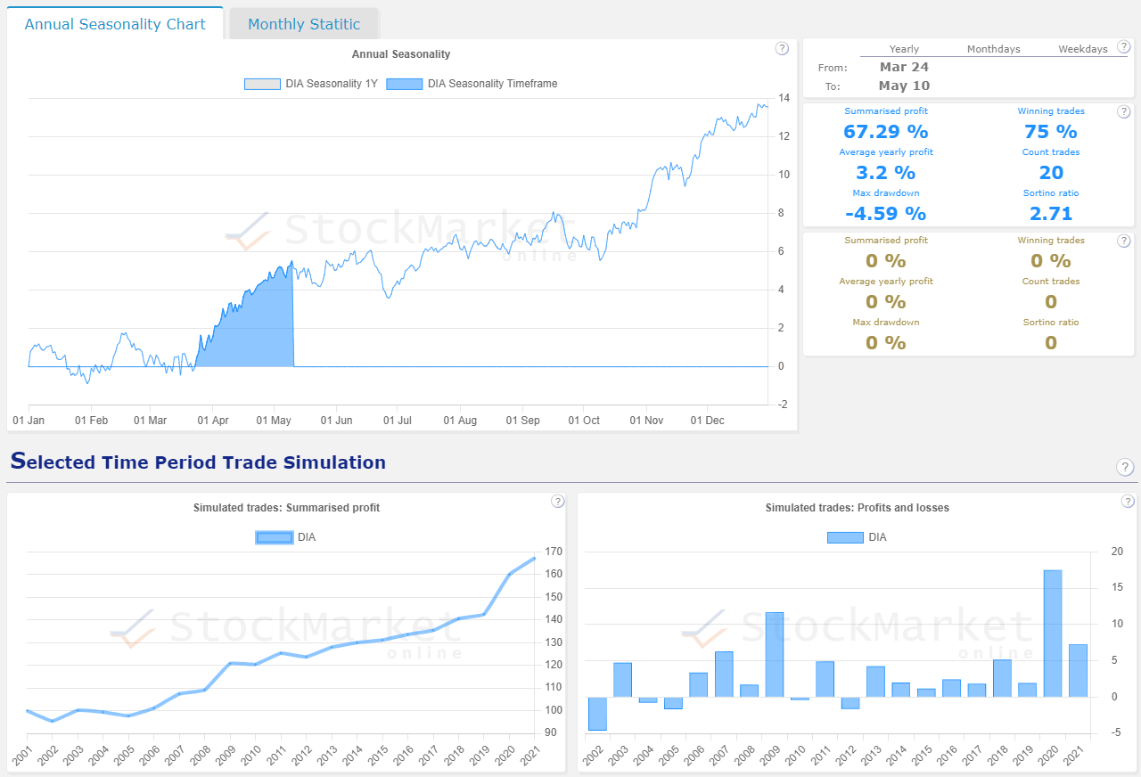
Seasonal pattern end of March to mid May
The seasonal analysis of the Dow Jones Index during this period shows the following result.
| KPI's | |
| Summarised profit | 67.29 % |
| Winning trades | 75 % |
| Average yearly profit | 3.2 % |
| Count trades | 20 |
| Max drawdown | -4.59 % |
| Sortino ratio | 2.71 |
| Count Winners | 15 |
| Count Losers | 5 |
From our experience, these are not the best metrics for a good recurring pattern. See the Dow Jones seasonality analysis.
Let's look at the second period together.
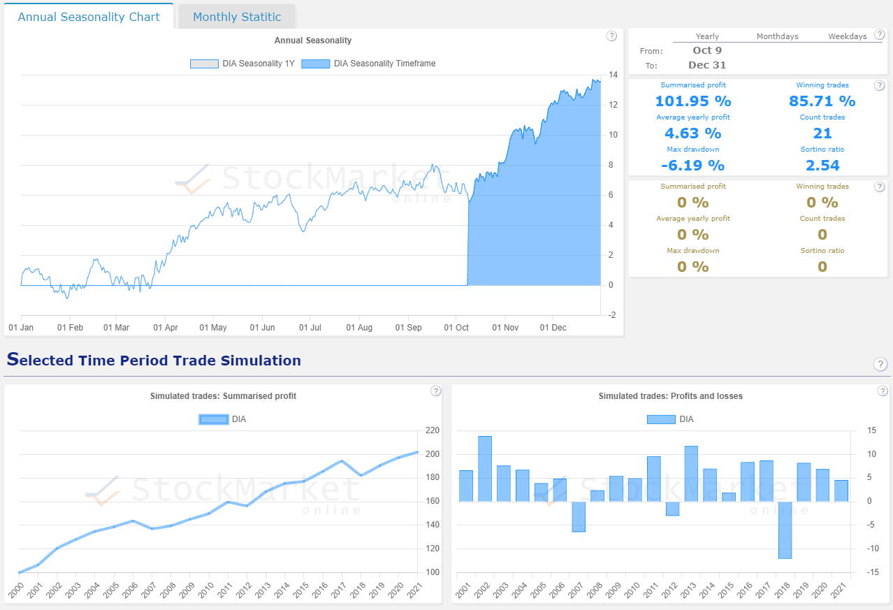
Seasonal pattern mid October to end December
The seasonal analysis of the Dow Jones Index during this period shows the following result.
| KPI's | Mar 24 - May 10 | Oct 9 - Dec 31 |
| Summarised profit | 67.29 % | 101.59 % |
| Winning trades | 75 % | 85.71 % |
| Average yearly profit | 3.2 % | 4.63 % |
| Count trades | 20 | 21 |
| Max drawdown | -4.59 % | -6.19 % |
| Sortino ratio | 2.71 | 2.54 |
| Count Winners | 15 | 18 |
| Count Losers | 5 | 3 |
As can be seen clearly in the table, the period from mid-October to the end of December shows better key figures.
Let's analyze the period from mid-October to the end of December in more detail.
Down Jones Detail Analysis - Mid-October to End of Year
We have already shown a picture of the seasonal analysis above. But let's take a closer look at it.
As already noted, the key figures for the recurring trend in the period from mid-October to the end of December are quite good. Not perfect, but good.
The average price performance of 4.63% is good for an index. The maximum drawdown of the performance curve of -6.19% is also ok.
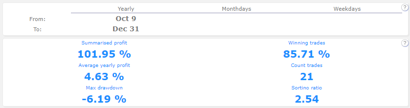
In 3 out of 20 years, the Dow Jones has performed negatively during this period.
These are the years:
- 2007
- 2012
- 2018
2007 was the precursor of the financial crisis, in which was a difficult stock market environment. However, in 2012, the market environment was relatively normal. 2018 was marked by a reduction in the money supply by the U.S. Federal Reserve, which is also a negative stock market environment.
Because 2007 and 2018 were negative years, we should also look at another crisis. For this, we extend the historical data to 24 years, so we can see the dotcom bubble data from 2000. It is interesting to note that the Dow Jones had a positive performance in 2008 (recession year) during this period. See the Down Jones 24 year seasonality analysis.

The analysis shows that in 2000, the Dow Jones performed 0.94% from mid-October to the end of December. This is positive, but not much.
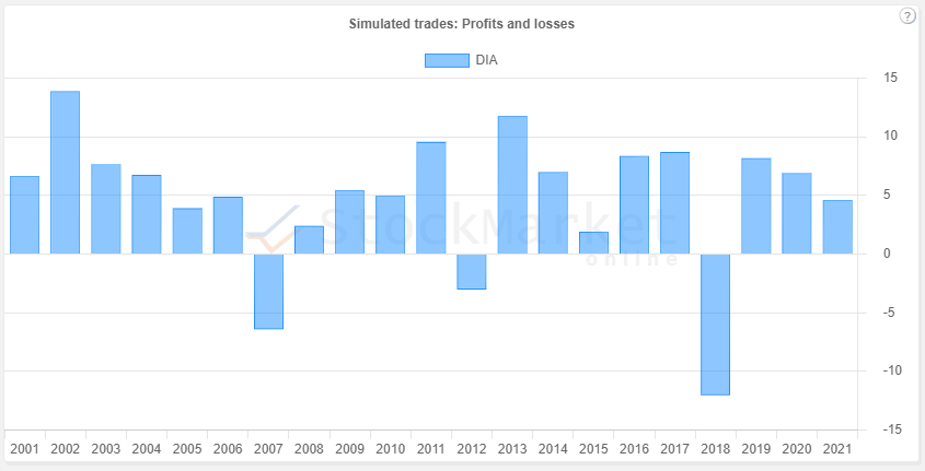
Let's look at the simulated trades that show how an investment has performed over the mentioned period of the last 20 years. The most interesting thing about the trade list is to find the trade with the highest drawdown. To find out, we simply sort the trade list in the "Maxdrop %" column.
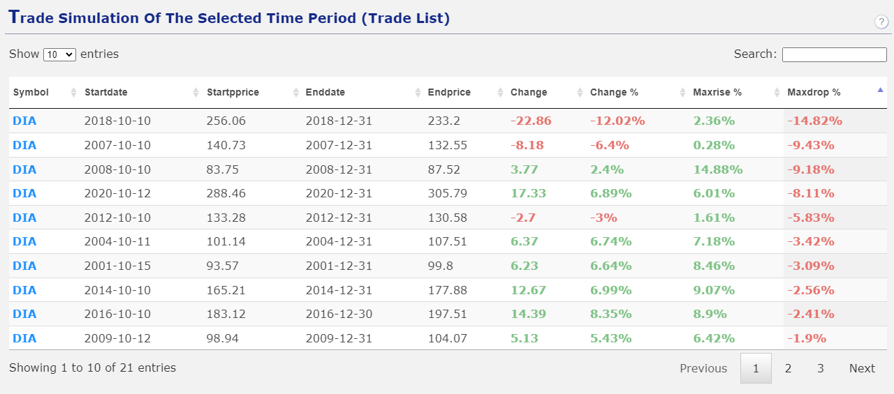
The maximum drawdown of -14.62% is relatively large.
Interim summary
From mid-October to the end of December, the Dow Jones performs on average 4.63%. In 3 out of 20 years there was a negative price development. Especially in times of crisis, there does not seem to be a good risk/reward ratio for this seasonal pattern.
Let's compare the Dow Jones with other indices.
Dow Jones (DIA) vs. SP500 (QQQ) - Comparison
Let's analyze which index would have been a better investment in the past from mid-October to the end of December.
The seasonal analysis of the Dow Jones Index during this period shows the following result.
| KPI's | Dow Jones Index (DIA ETF) |
SP 500 Index (SPY ETF) |
| Summarised profit | 101.59 % | 93.52 % |
| Winning trades | 85.71 % | 80.95 % |
| Average yearly profit | 4.63 % | 4.25 % |
| Count trades | 21 | 21 |
| Max drawdown | -6.19 % | -7.42 % |
| Sortino ratio | 2.54 | 1.89 |
| Count Winners | 18 | 17 |
| Count Losers | 3 | 4 |
The numbers show that over the past 20 years, the Dow Jones has outperformed from mid-October to the end of December.
The following picture shows the seasonal chart analysis. See the Dow Jones vs. SP500 analysis.
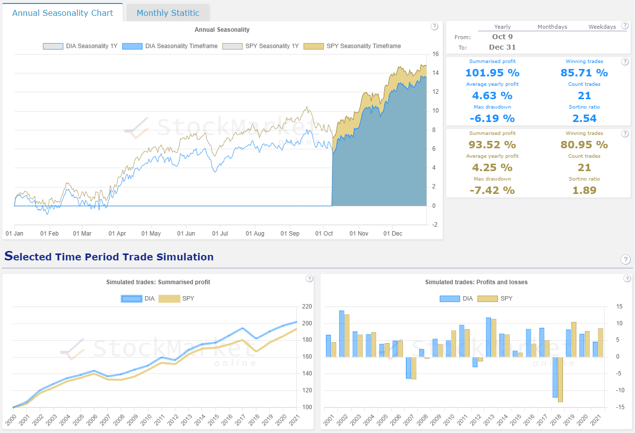
The lower right chart is particularly interesting. This shows in which years the Dow Jones or the SP500 performed better. It is noticeable that the Dow Jones lost less than the SP500 in the bad years and that the SP500 performed better than the Dow Jones Index, especially in the last three years.
Dow Jones (DIA) vs. NASDAQ (QQQ) - Comparison
Let's analyze which index would have been a better investment in the past from mid-October to the end of December.
The seasonal analysis of the Dow Jones Index during this period shows the following result.
| KPI's | Dow Jones Index (DIA ETF) | Nasdaq Index (QQQ ETF) |
| Summarised profit | 101.59 % | 117.55 % |
| Winning trades | 85.71 % | 80.95 % |
| Average yearly profit | 4.63 % | 5.34 % |
| Count trades | 21 | 21 |
| Max drawdown | -6.19 % | -7.33 % |
| Sortino ratio | 2.54 | 2.48 |
| Count Winners | 18 | 17 |
| Count Losers | 3 | 4 |
The numbers show that over the past 20 years, the NASDAQ has outperformed from mid-October to the end of December.
The following picture shows the seasonal chart analysis. See the Dow Jones vs. Nasdaq analysis.
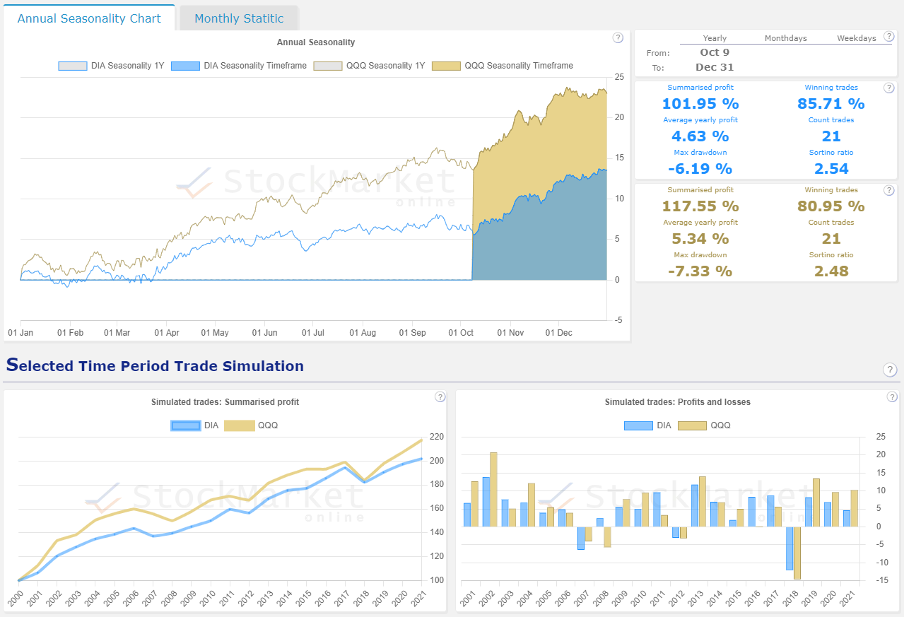
The lower right chart is particularly interesting. It shows in which years the Dow Jones or the NASDAQ performed better. It is noticeable that the Dow Jones lost less than the NASDAQ in the bad years and that the NASDAQ performed better than the Dow Jones Index in 12 years. 12 out of 20 years is not significantly significant. But especially in the last three years, the Nasdaq has outperformed the Dow Jones Index.
Summary
An annual investment in the Dow Jones in the period from October 9 to December 31 was a very good idea in the past. There were only three exceptions, which were characterized by turbulent stock market times. However, it must be emphasized that even in turbulent times (for example, in 2008), there were price gains in this period.
In comparison with other indices, the recurring pattern of the Dow Jones is better than the pattern of the SP500 index and it is better than the seasonal trend of the Nasdaq under the point of drawdowns (which we measure by the Sortino Ratio). However, in performance comparison, the Nasdaq has delivered a higher return.
Basically:
If the stock market is in a normal environment, the period from mid-October to the end of December shows good opportunity/risk potential. In turbulent times in the past, profits were also sometimes made in these months. However, in turbulent times, there is a higher risk potential. Who wants to trade this pattern in these times should compensate for the higher risk in the market by a smaller position size in the portfolio.